Home // Coronavirus
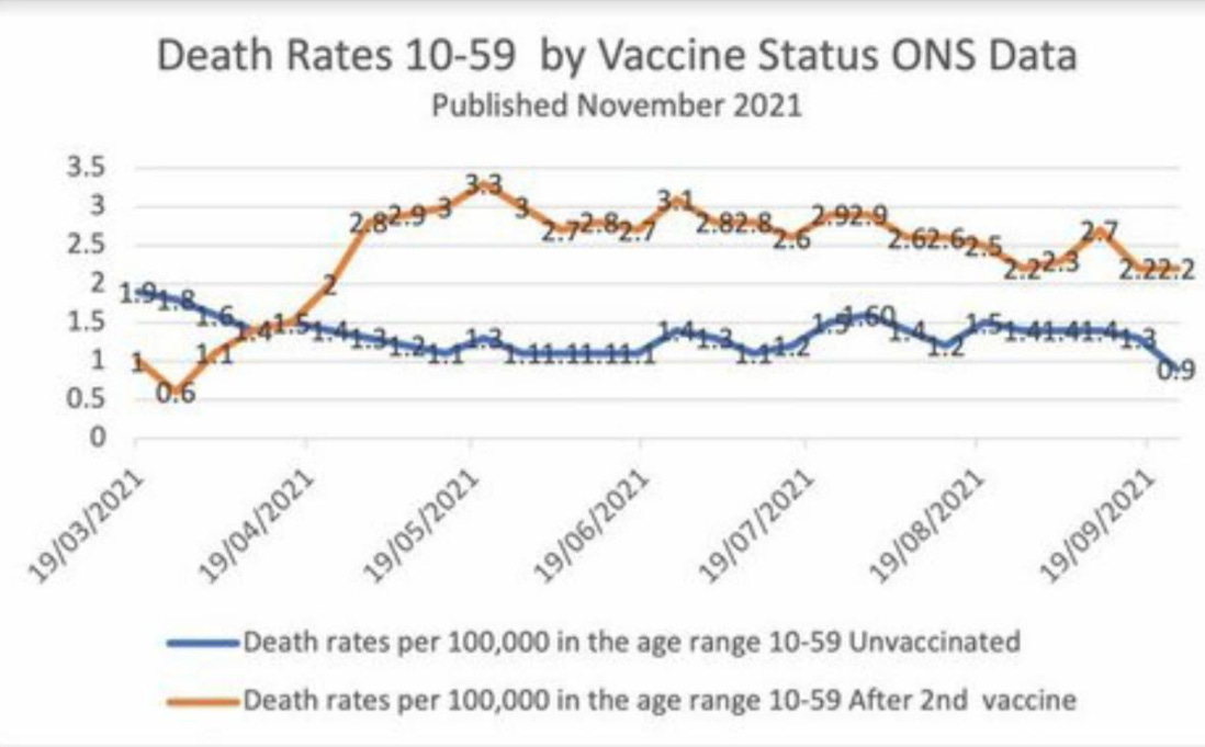
Vaccinated English adults under 60 are dying at twice the rate of unvaccinated people the same age
11/22/2021 // News Editors // Views
Tags: badhealth, badmedicine, Big Pharma, Dangerous Medicine, depopulation, genocide, pandemic, pharmaceutical fraud, spike protein, truth, UK, unvaccinated, vaccinated, Vaccine deaths, vaccines

(Article by Alex Berenson republished from AlexBerenson.Substack.com)
The blue line represents weekly deaths from all causes of unvaccinated people per 100,000 in the same age range.
I have checked the underlying dataset myself and this graph is correct. Vaccinated people under 60 are twice as likely to die as unvaccinated people. And overall deaths in Britain are running well above normal.

I don’t know how to explain this other than vaccine-caused mortality.
The basic data is available here, download the Excel file and see table 4:
https://www.ons.gov.uk/peoplepopulationandcommunity/birthsdeathsandmarriages/deaths/datasets/deathsbyvaccinationstatusengland
Read more at: AlexBerenson.Substack.com
Related Topics
badhealth badmedicine Big Pharma Dangerous Medicine depopulation genocide pandemic pharmaceutical fraud spike protein truth UK unvaccinated vaccinated Vaccine deaths vaccinesLatest News
Related News
11/21/2023 / By Ethan Huff
11/21/2023 / By Cassie B.
11/21/2023 / By Olivia Cook
11/21/2023 / By Kevin Hughes
11/20/2023 / By Cassie B.
11/20/2023 / By Ava Grace
Take Action:
Support Natural News by linking to this article from your website.
Permalink to this article:
Copy
Embed article link:
Copy
Reprinting this article:
Non-commercial use is permitted with credit to NaturalNews.com (including a clickable link).
Please contact us for more information.
Please contact us for more information.


